One of the few things I studied in the Google UX Design course is how a good UX design should be fun to use. Google didn’t exactly use the word "fun" to describe a good UX design, the exact word is "enjoyable"
"If a product is enjoyable, it means the design delights the user. The design reflects what the user may be thinking or feeling and creates a positive connection with them. A product’s design doesn’t have to be enjoyable for it to function properly. But, an enjoyable design adds to an already functional product and can enhance the user’s feelings about the experience." - Google UX Design course
But what exactly are "micro-interactions" and how come they are related to this?
"Micro-interactions are events which have one main task - a single purpose - and they’re found all over your device and within apps. Their purpose is to delight the user; to create a moment that is engaging, welcoming and, dare we say it - human." - UXDesign.cc
Okay, so in order to maker my site more engaging and enjoyable, I decided to add some micro-interactions/ animation to it. I’m not planning to add back all the stuff that I have got rid of, instead, I’m going to add some small other thing. One of the big reasons I decided to simplify my website in the first place is this because animations seems not work correctly on some devices.
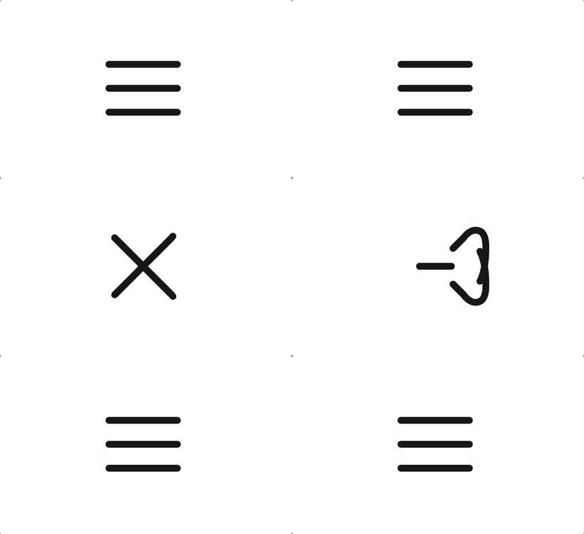
Toggle menu (hamburger) icon 🍔 #
First is the toggle menu for mobile devices from UXDesign.cc with a little tweak from me:

I use React for my website but below is the plain HTML/CSS code shared by Mikael Ainalem from UXDesign.cc. I recommend you check out his article on how this icon and animation is made. It’s fascinating.
<button
  class="menu"
  onclick="this.classList.toggle('opened');this.setAttribute('aria-expanded', this.classList.contains('opened'))"
  aria-label="Main Menu"
>
  <svg width="100" height="100" viewBox="0 0 100 100">
    <path
      class="line line1"
      d="M 20,29.000046 H 80.000231 C 80.000231,29.000046 94.498839,28.817352 94.532987,66.711331 94.543142,77.980673 90.966081,81.670246 85.259173,81.668997 79.552261,81.667751 75.000211,74.999942 75.000211,74.999942 L 25.000021,25.000058"
    />
    <path class="line line2" d="M 20,50 H 80" />
    <path
      class="line line3"
      d="M 20,70.999954 H 80.000231 C 80.000231,70.999954 94.498839,71.182648 94.532987,33.288669 94.543142,22.019327 90.966081,18.329754 85.259173,18.331003 79.552261,18.332249 75.000211,25.000058 75.000211,25.000058 L 25.000021,74.999942"
    />
  </svg>
</button>.menu {
background-color: transparent;
border: none;
cursor: pointer;
display: flex;
padding: 0;
}
.line {
fill: none;
stroke: black;
stroke-width: 6;
transition:
stroke-dasharray 600ms cubic-bezier(0.4, 0, 0.2, 1),
stroke-dashoffset 600ms cubic-bezier(0.4, 0, 0.2, 1);
}
.line1 {
stroke-dasharray: 60 207;
stroke-width: 6;
}
.line2 {
stroke-dasharray: 60 60;
stroke-width: 6;
}
.line3 {
stroke-dasharray: 60 207;
stroke-width: 6;
}
.opened .line1 {
stroke-dasharray: 90 207;
stroke-dashoffset: -134;
stroke-width: 6;
}
.opened .line2 {
stroke-dasharray: 1 60;
stroke-dashoffset: -30;
stroke-width: 6;
}
.opened .line3 {
stroke-dasharray: 90 207;
stroke-dashoffset: -134;
stroke-width: 6;
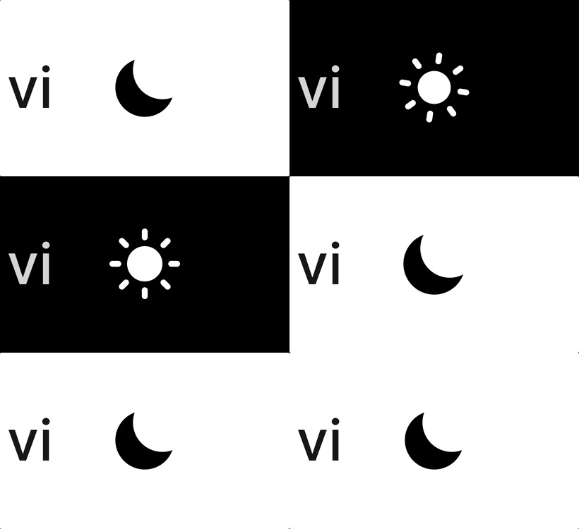
}Theme toggle icon ☀️/🌙 #
Second, is the theme toggle icon from the top right corner:

For this one, I use React Spring to animate SVG icons based on the instruction from jfelix.info with another small tweak from me to match with the current setup from my site. You can find the source code here at GitHub.
That’s it for now. I hope you enjoy my sharing and if you have any questions, feel free to leave a comment below.