For a web blog, accessibility is important. It’s not just about making the site accessible for people with disabilities, but also for people with slow internet connection, or people who use old devices. It’s also about making the site accessible for search engines, so that they can index the site properly. I had always find my old site to be lacking in this regard, so I decided to improve it. And here’re some of my thoughts along the way:
Font Face #
I used to use Inter as the font face for my site. It’s a great font for general purpose, but recently I have found myself growing fond of Geist fonts (Geist Sans and Geist Mono) by Vercel. I think it’s the best mix of Inter, Univers, SF Mono, SF Pro, Suisse International, ABC Diatype Mono, and ABC Diatype. It’s also free and open source, so I decided to use it for my site.
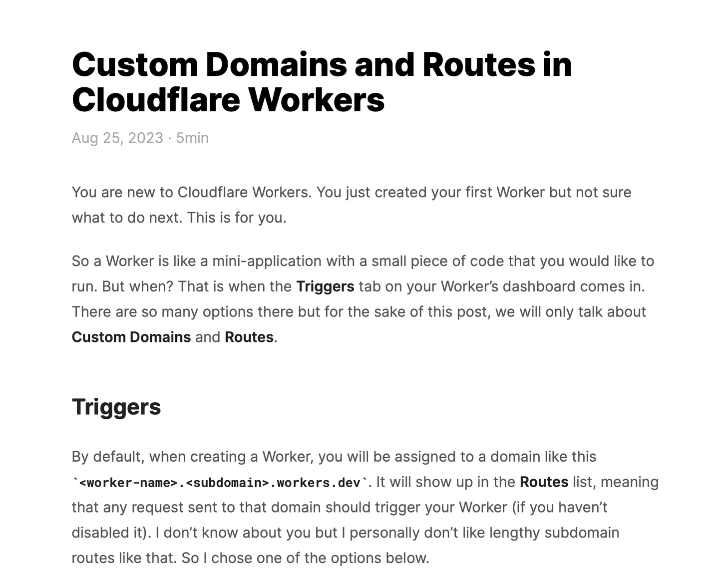
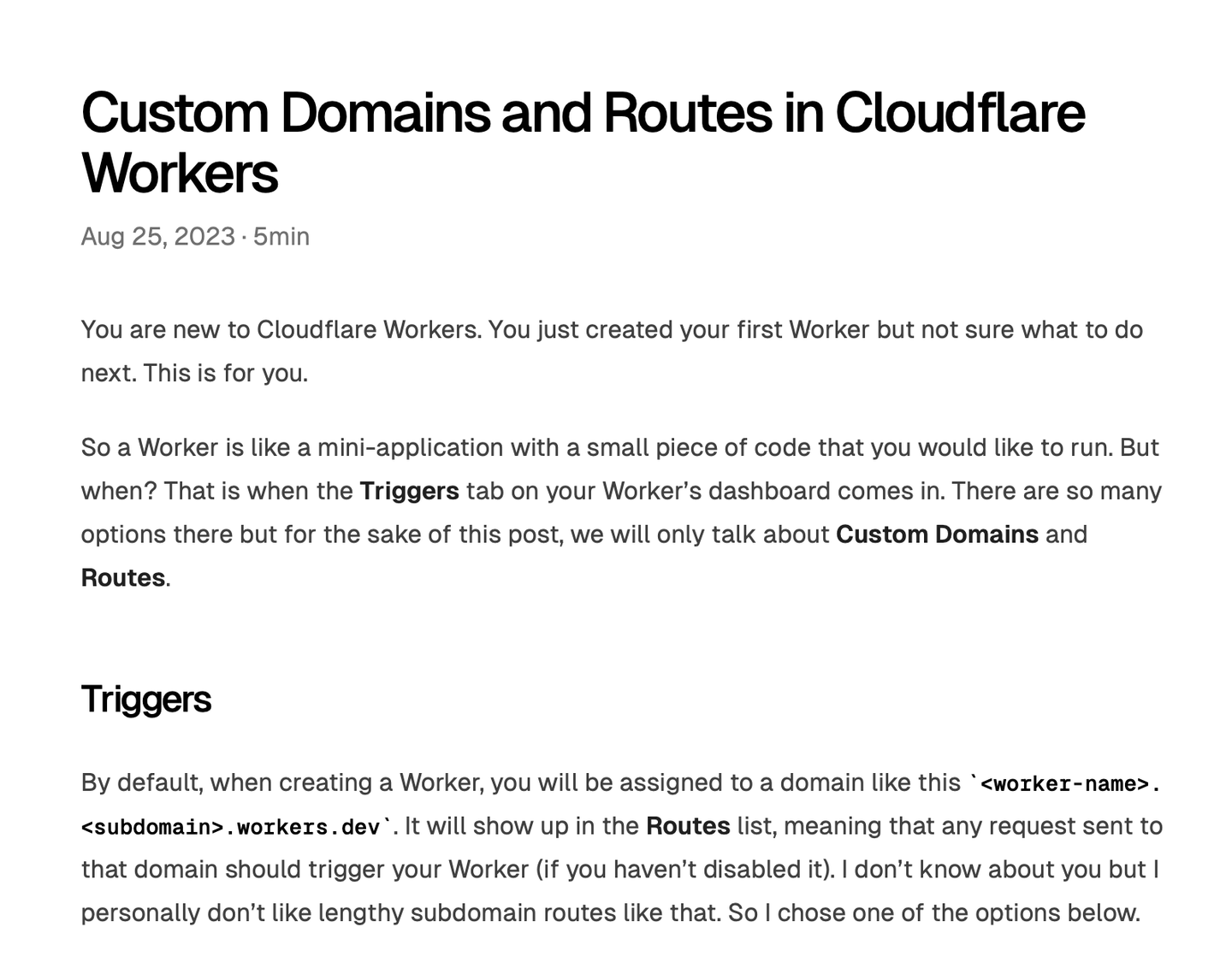
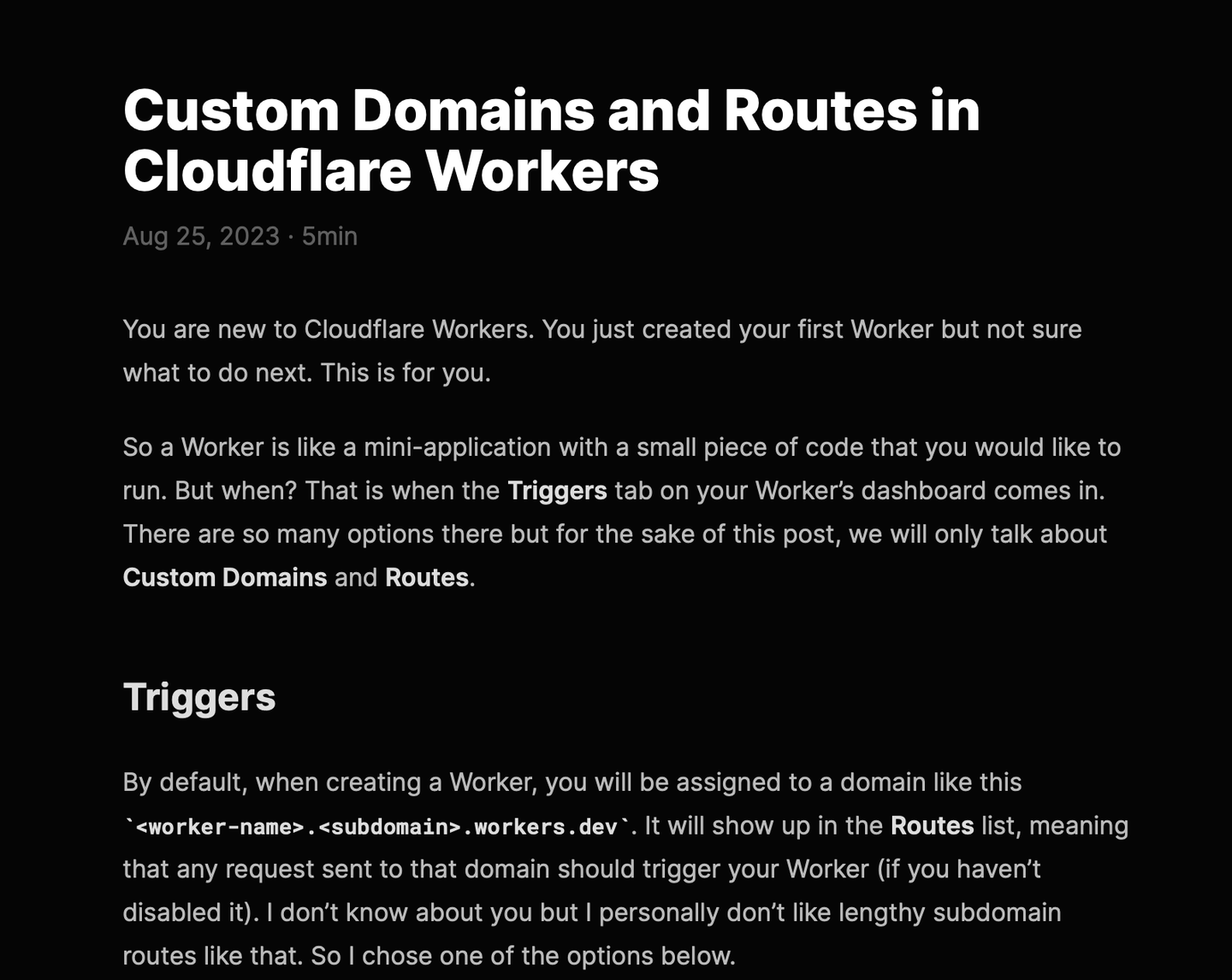
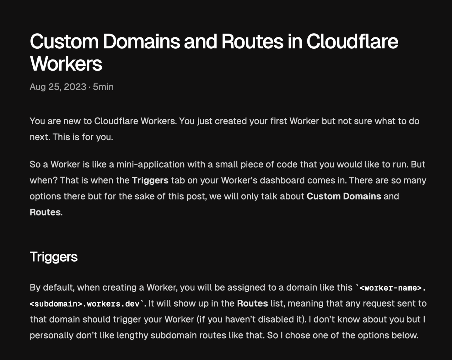
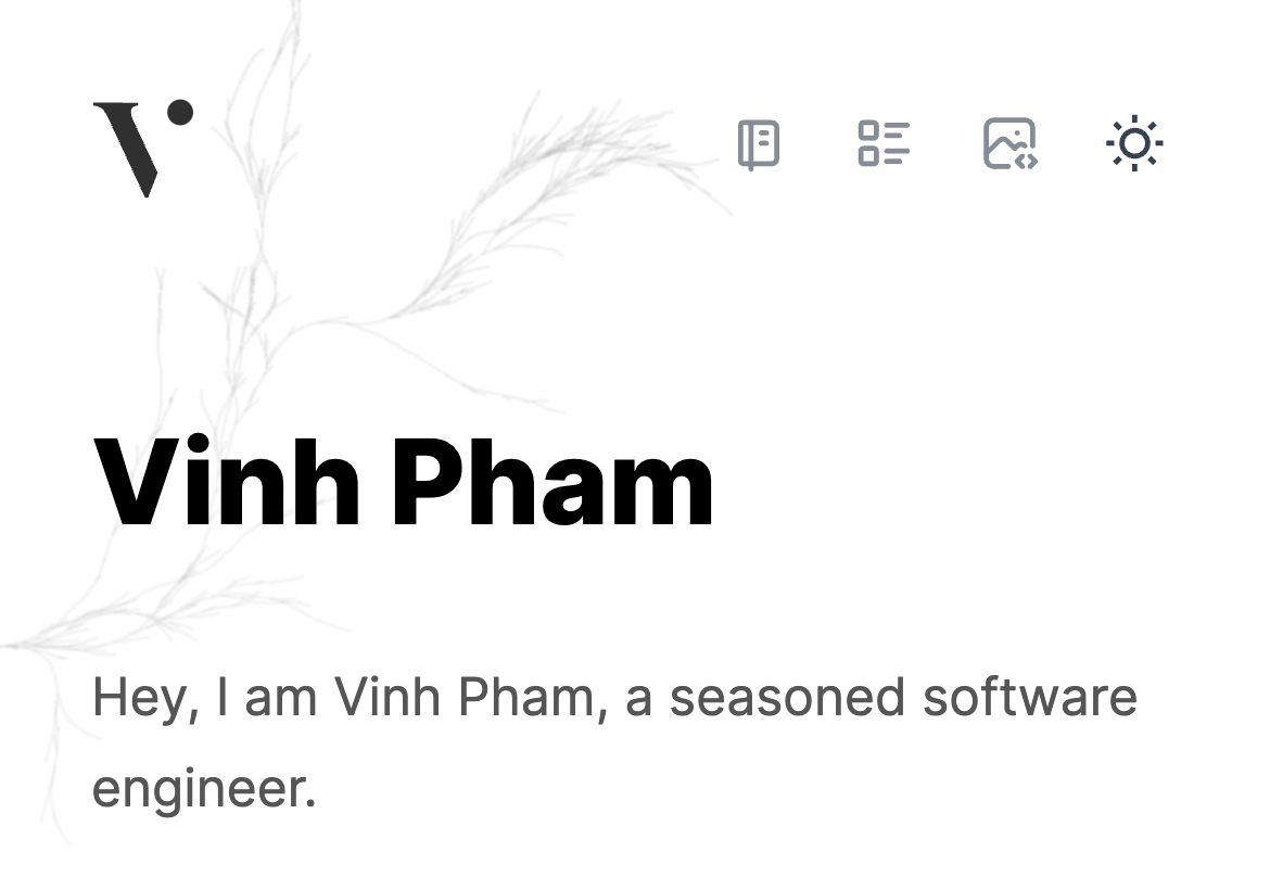
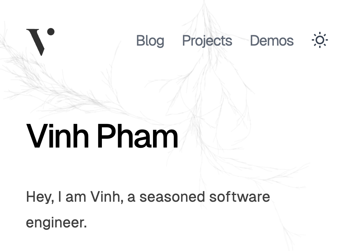
I also decided to "unbold" all the headings so it doesn’t feel like you’re being yelled at. Here’s the comparison:
Color Contrast #
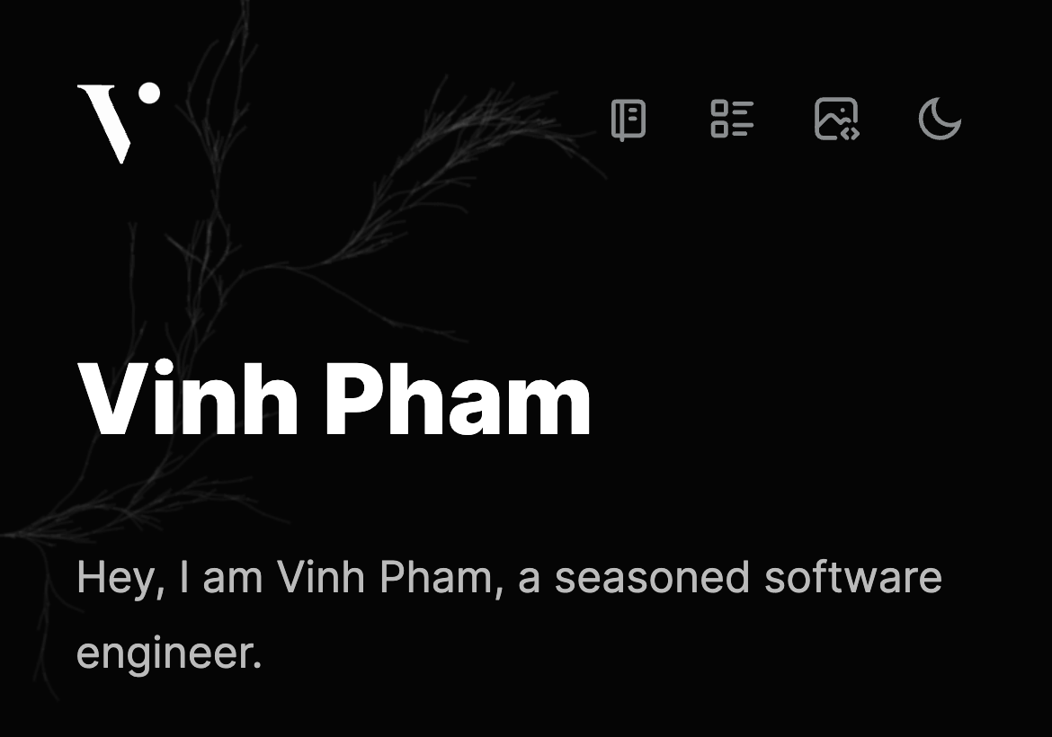
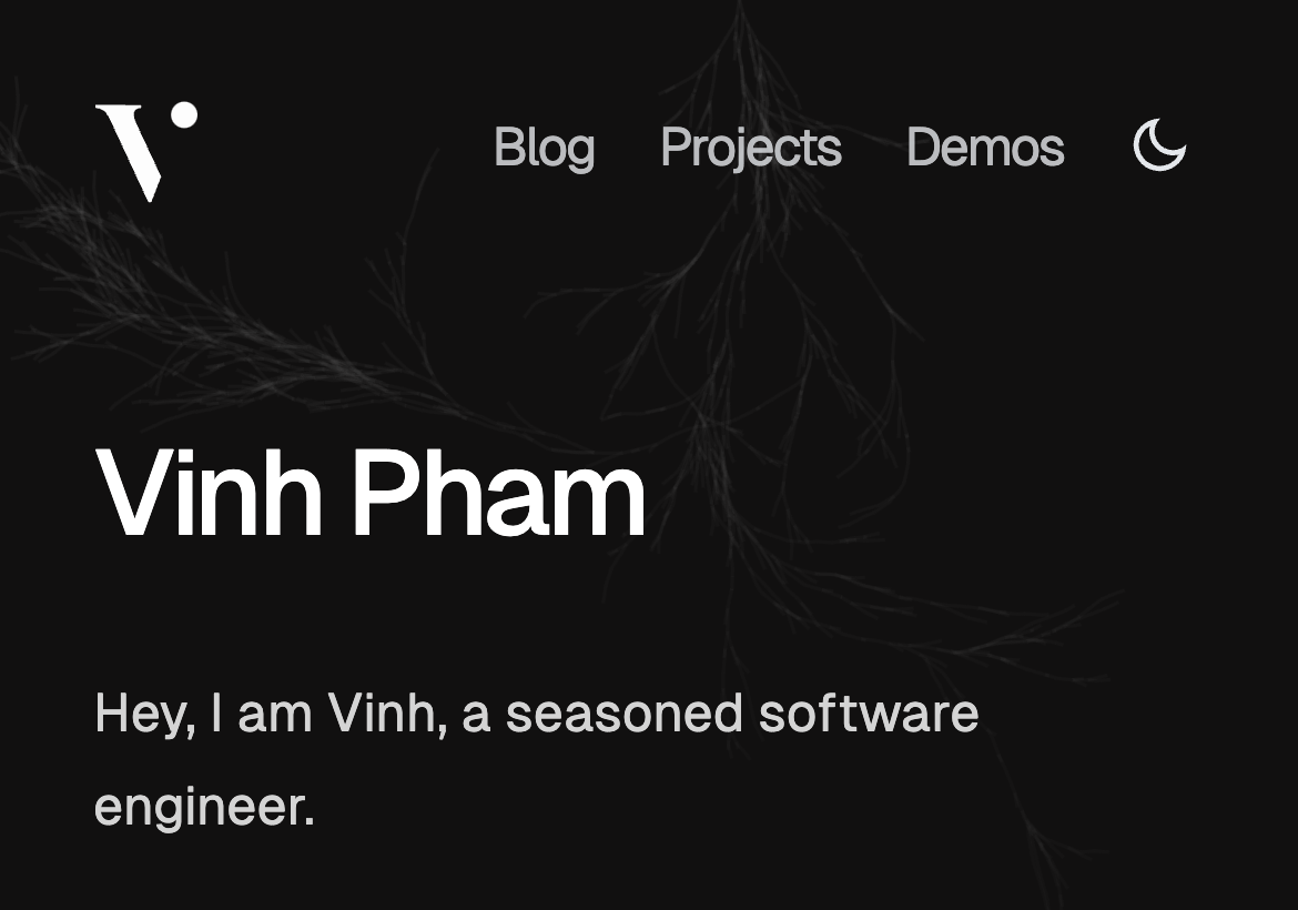
If you look at the above images, you will notice that the new site has a higher contrast than the old one, both in the main text and the subtext. Color contrast is probably the main thing that prevents my old site from scoring 100 in the Lighthouse accessibility test. I have decided to fix this by increasing the contrast of the text and the background. I also decided to use a darker shade of gray for the subtext, so that it’s easier to read.
For the dark theme, I also switched from using a black background to a dark gray background. This is because I found that it’s easier to read the text on a dark gray background than on a black background, and that is important for a blog site.
Icons or Texts? #
The answer is both if we’re talking about what best for accessibility. But in some cases, it can be a bit complicated. Let’s talk about my site’s top navigation bar for example. In the desktop view, there is a lot of real estate, so I can use both icons and texts. I can even leave it icons only, and add in the tooltip for accessibility. But in the mobile view, there is not much space, so I had to choose between icons or texts. I decided to turn every item to icons in the mobile view, and it created a whole lot of confusion. On the first look, will you know what the icons mean? Maybe some, but not all of them. So I turned to texts with a little narrower spacing between the characters, and I think it’s a improvement. Here’s the comparison:
Conclusion #
I think the new site is a lot better than the old one in terms of accessibility. It’s not perfect, but it’s a lot better. I hope you like it too. If you have any feedback, please let me know. I would love to hear from you.